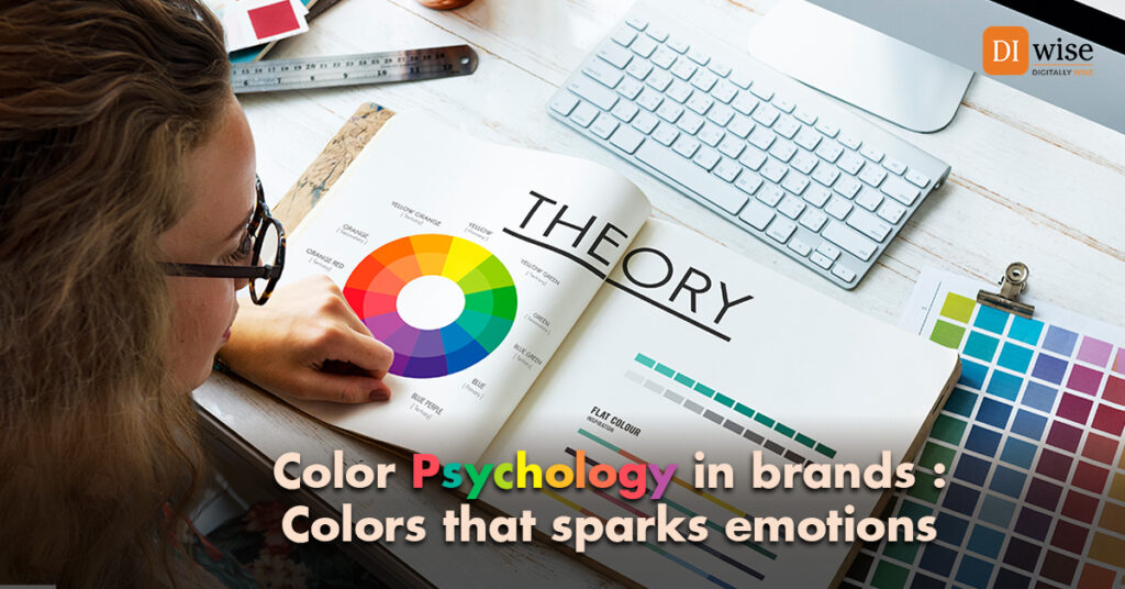
“Colors, like features, follow the changes of the emotions.” – Pablo Picasso
Imagine strolling down a bustling street, bombarded with sights and sounds. Suddenly, a storefront catches your eye, not with flashy neon signs or loud music, but with its very aura. A calming blue beckons you closer, whispering promises of trust and security. Or perhaps it’s a vibrant red, radiating excitement and energy, urging you to step inside and explore. This, my friends, is the magic of color psychology in branding. It’s not just about aesthetics; it’s about wielding the power of color to paint a picture that resonates deep within us, influencing our emotions and even our buying decisions.
Unveiling the Emotional Palette:
Colors are more than just pigments on a screen; they’re potent emotional triggers. A fiery red ignites passion and excitement, while a serene blue evokes calmness and trust. Lush greens whisper of nature and growth, while sunshine-like yellows radiate optimism and warmth. Understanding these inherent associations is the first step for brands to unlock the emotional spectrum and connect with their audience on a deeper level.
From Vision to Emotion:
Imagine a tech company seeking to project an image of innovation and reliability. They might choose a blue palette, its hues symbolizing trust, security, and cutting-edge technology. A fitness brand aiming to motivate and energize might opt for a burst of vibrant oranges and reds, colors associated with action, energy, and a healthy lifestyle. These color choices go beyond mere decoration; they become an extension of the brand’s personality, values, and the emotions they want to evoke.
Beyond the Logo: Painting a Cohesive Picture:
So, how do brands translate this color psychology into a tangible experience? It starts with a deep understanding of their target audience and the emotions they want to cultivate. Then, comes the meticulous selection of a color palette that aligns seamlessly with their brand values and messaging. This extends far beyond logos and websites, encompassing packaging, marketing materials, and even the physical environment of their stores. Imagine stepping into a clothing store bathed in warm, earthy tones, instantly feeling a sense of comfort and natural connection with the brand’s eco-conscious values.
A Brushstroke of Caution:
It’s important to remember that color psychology isn’t a magic formula, and cultural nuances can influence how colors are perceived. However, by understanding the emotional power of colors and wielding them with intention, brands can create a visual language that transcends words, building lasting connections and fostering brand loyalty.
Remember, color is a powerful tool. Use it wisely to paint a picture that speaks louder than words, leaving a lasting impression and forging meaningful connections.

